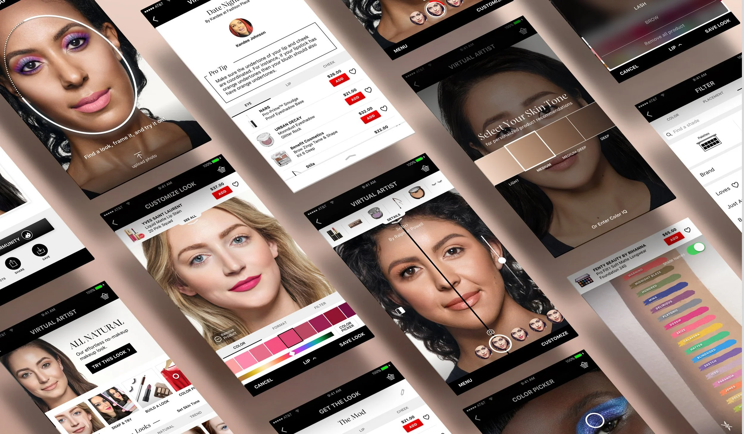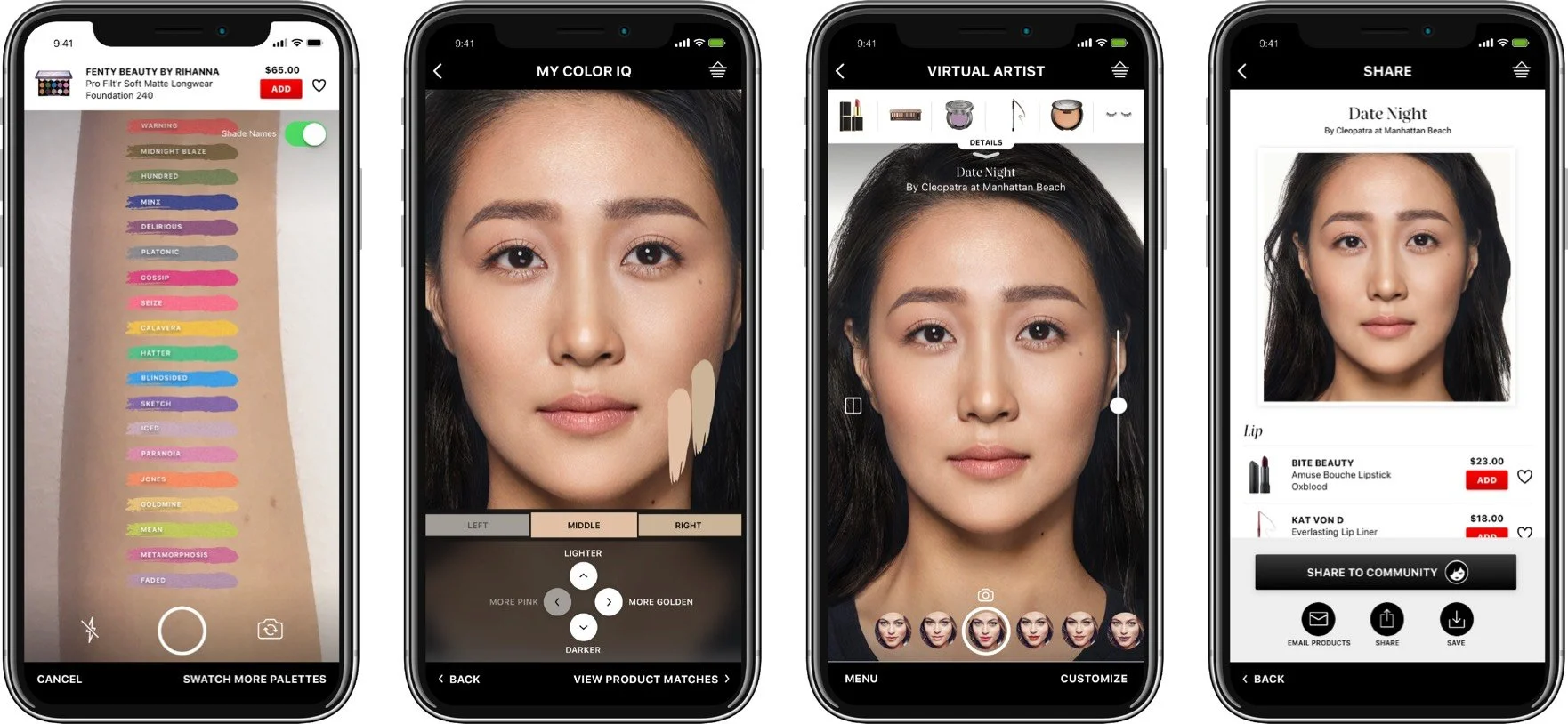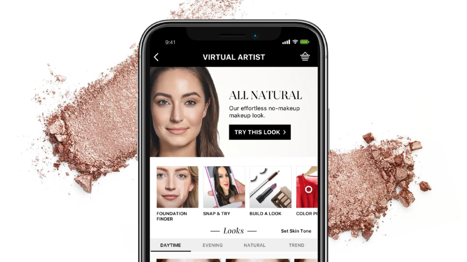
Sephora Virtual Artist
Revolutionizing virtual makeup application experience — Exploration to Transaction
Overview
Sephora is one of the biggest beauty retailers in the world. They feature thousands of products from makeup, skincare, haircare, fragrances, from over 300+ iconic brands, along with its esteemed private label. It become a popular destination for beauty enthusiasts who seek the latest and greatest in the beauty industry.
The Challenge
In 2017, the iconic luxury beauty retailer reengaged the design team at Hero Digital to update and add features to our 3rd consecutive iteration of their award-winning augmented reality iOS and Android native app.
As the app progressed, more features were added without thoughtful planning and consideration. As a result, the latest iteration of the app’s experience suffered and became extremely cluttered and bloated.
Our client, Sephora Innovation Labs, was struggling with providing assistance and integrating new functionalities while also ensuring good performance.
Services
Platform Audit
Landscape Analysis
Research Insights
Personas
User Flows
Wireframes
Prototypes
Visual design
Awards
Clio Award - Beauty Gold 2018
Role
UX / UI Designer
Researcher
Agency
Hero Digital
The Solution
As part of the 5.0 effort, I worked alongside with team and led the research and design strategy to built upon our previous work to improve the overall user experience while integrating new product features: color matching, saving looks, social sharing, new tutorials, and improved purchasing experience for products directly through the app.
Goals:
Declutter the app experience
Elevate product discovery and promoting exploration
Restructuring product hierarchy and personalization
Optimize the conversion of transactions through exploration
STRATEGY
Simplify the experience without compromising discoverability and the robust set of features

1
Discovery
Research
Heuristic Evaluation
Contextual inquiries
Competitive analysis
User interviews
Online surveys and reviews
In the discovery phase, we strategize on our approach to first gather any business insights and data from our client to supplement our comprehensive customer research and market trends analysis.
Assessing the Current App
To get a lay of the land, we began a thorough assessment the current mobile app experience. We immediately noted a tremendous amount of content jam packed onto every screen of the experience flow.
Five iterations later, the original mobile screen layout had not been modified and had clearly outgrown itself — it’s growing pains left no space for accommodating additional features comfortably.
Virtual Artist- Homepage
We began by evaluating the three main customer journey flows within the old app
Product Try-On
Looks
Virtual Tutorials
FEATURE EVALUATION
Product Try-on
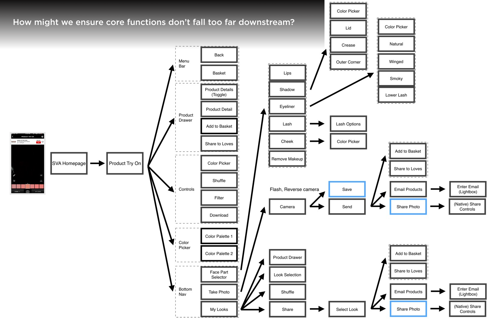
Since the product try on experience was the bread and butter to this app. I started the discovery processed here. Immediately my attention went directly to the visual cacophony of controls - they were static and taking up prime real estate on majority of the screens.
Most screens consisted over 15+ touchpoints (color matcher, product shuffle, filter, download, product color palette, etc).
The bloated touchpoints not only contributed to the visual chaos and clutter on an already small mobile screen - the performance was adversely affected resulting in high bounce rate and task abandonment.
Assessing Current Paths
After developing flows chats for all of the current screens and options, we can clearly see that the navigation is extremely complex. Many things stood out, including the need to surfacing up the core functions and consolidating repetitive touch points.
2
Define
After collecting and synthesizing all the data from the research phase, we mapped out all current proposed enhancements and new feature sets to streamline the entire mobile experience . Personas were developed based on our findings and key motivations from in-store research and contextual inquires. Micro-moments were developed to streamline the design strategy to the mobile experience.
Experience Principles
Make it Simple
• Allow customers to easily navigate through existing and new product features.
• Provide consistent intuitive way-finding throughout the experience.
• Ensure relevant tools are handy while maintaining a simple interface.
Make it Fun
• Invite customers to engage with the tool via attract mode.
• Promote photo booth by incorporating feature into the flow.
• Allow customers to save product lists and share photos.
Make it Educational
• Guide customers throughout their experience.
• Provide relevant recommendations based on customer profile.
• Allow customers to learn new tips and tricks.
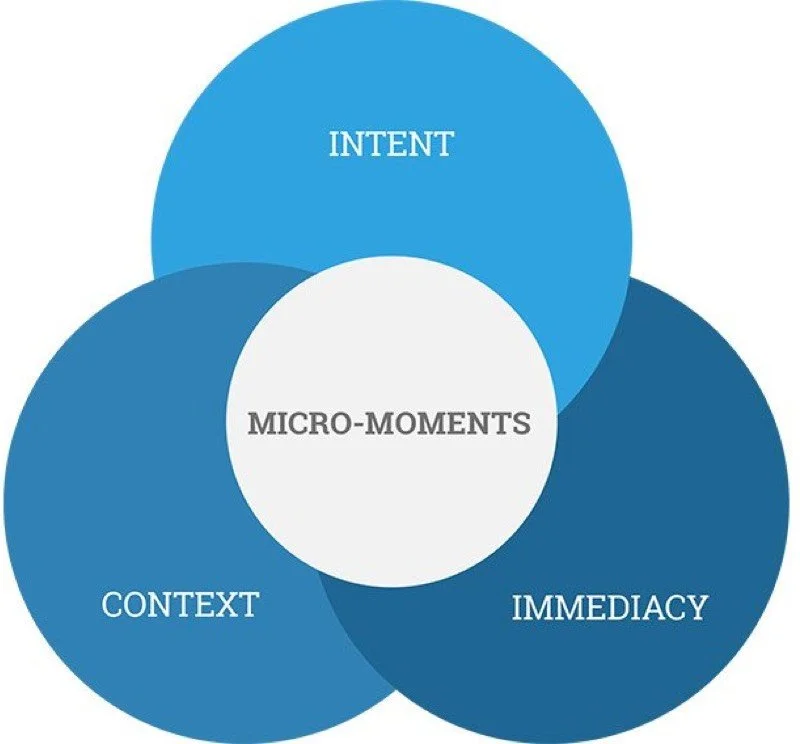
Designing Micro-Moments
Micro-moments are intent rich moments when decisions are made and preferences are shaped.
As part of the exercise of simplifying the app experience, we took a step back to assess the user's browsing habits. Based on research findings, consumers on average checked their phones 150 times a day for a total of 300 minutes — consumers are spending 2 minutes per session on their phones. In 2 minutes, for consumers to be able to complete a task, apps must be hyper-vigilant and create goal-based pathways that are extremely clear and straightforward.
One of the strategies proposed by Google, is to shape the product experience based on micro-moments - moments of a consumer's life when they reflexively turn to a device to act on a need to learn something, do something, discover something, watch something, or buy something.
Newly developed flows adapting micro-moments for the Sephora virtual app to guide the end user’s experience.
Pink : “I-Want-to-Capture” moments
Blue: “I-Want-to-Play” moments
Yellow: “I-Want-to-Grow” moments
Dashboard - Page Updates for “I Want-to-Play” moments
Camera - Page Updates supporting “I-Want-to-Play” moments
New and Improved Flows
Reshaping the experience
Wireframes + Concept Ideation
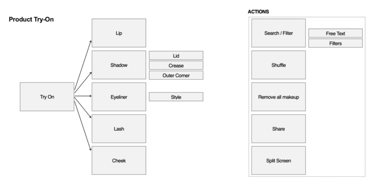


Organizing the Whole Experience
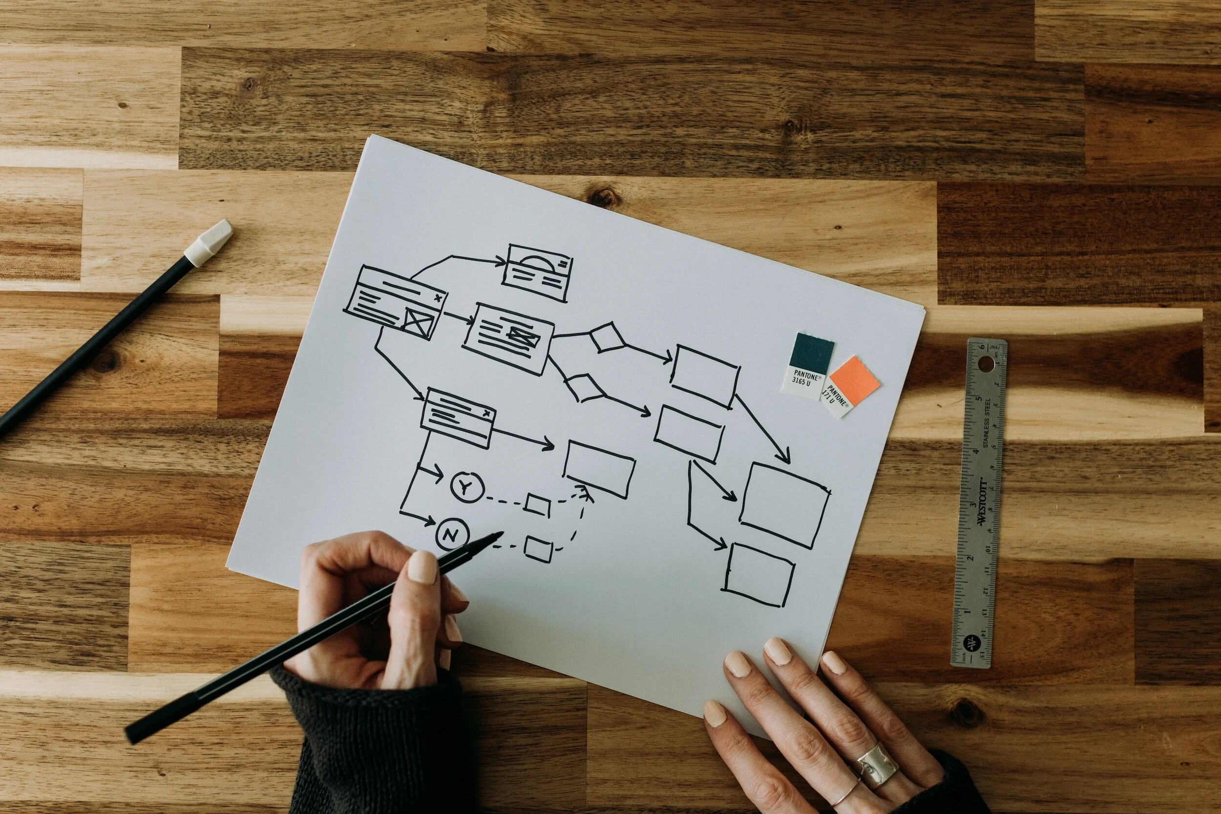
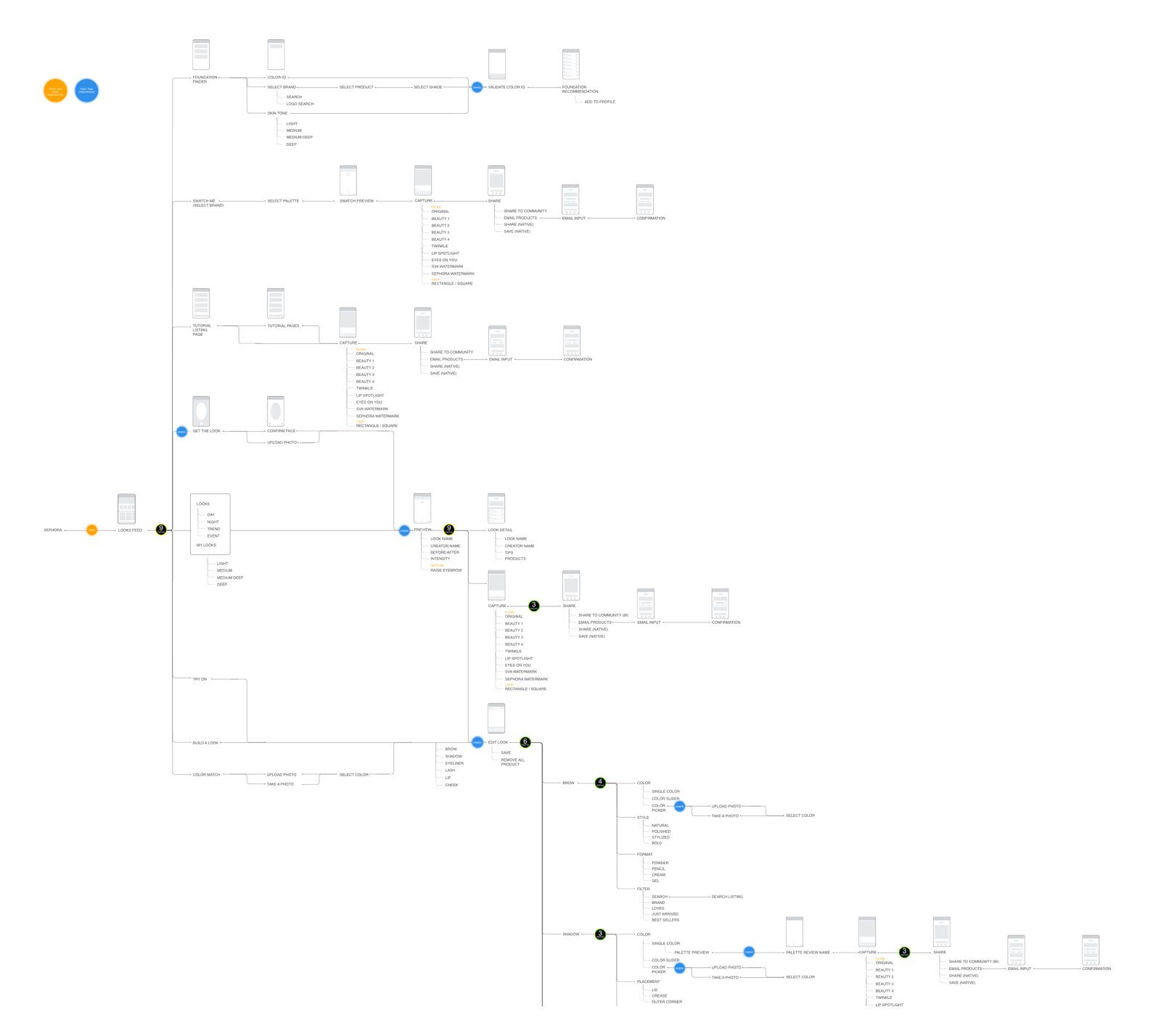
I developed a master flow diagram and documentation to capture and illustrate all of the numbers of touch points and options on a page to quantify, track, and visually communicate the complexities and nuances.
3
Design
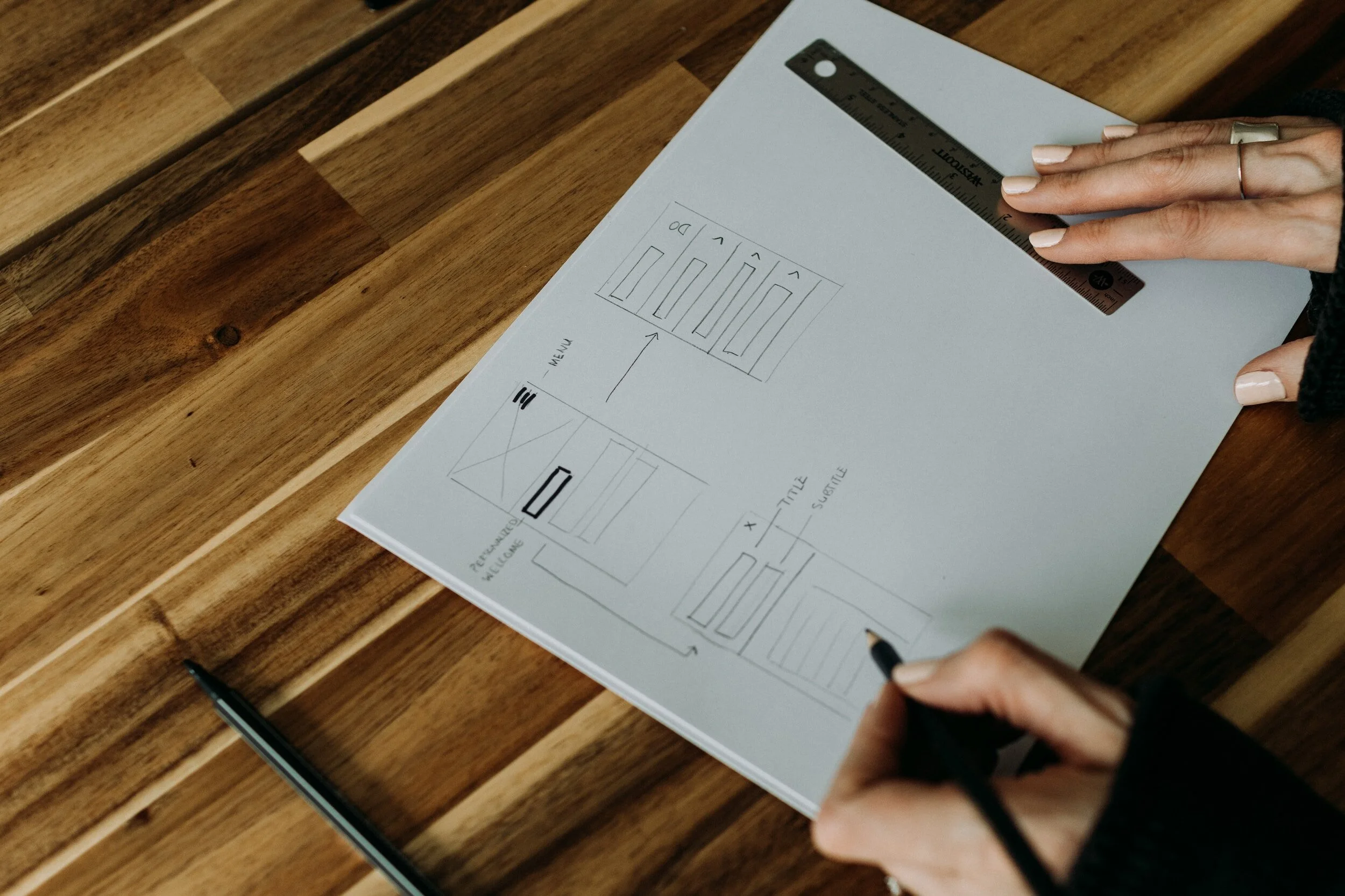
During the design phase, I began with connecting, developing mock-ups and compositions. Created wireframes to prototype and for user testing. Then iterating our evaluative research findings into the hi-fidelity screens for iOS and Android screens.
Building the experience
We explored three ways to organize the experience. Since Product Try-On was the most popular feature we focused on immediately taking customers to this feature first upon engaging with the product.
The first option starts in the Product Try-On experience with all shadow areas exposed. Customers can navigate between features and schedule appointments by accessing the hamburger menu.
The second option exposes the features via a tabbed navigation at the top, exposing all features.
The third exploration is a guided step-by-step process where customers navigate through one section at a time.
Building on the Foundation
To ensure scalability and consistency, we also looked at how we might organize the tools across the experience features.
Looks: Curated looks for any Occasion
Prototype + Testing
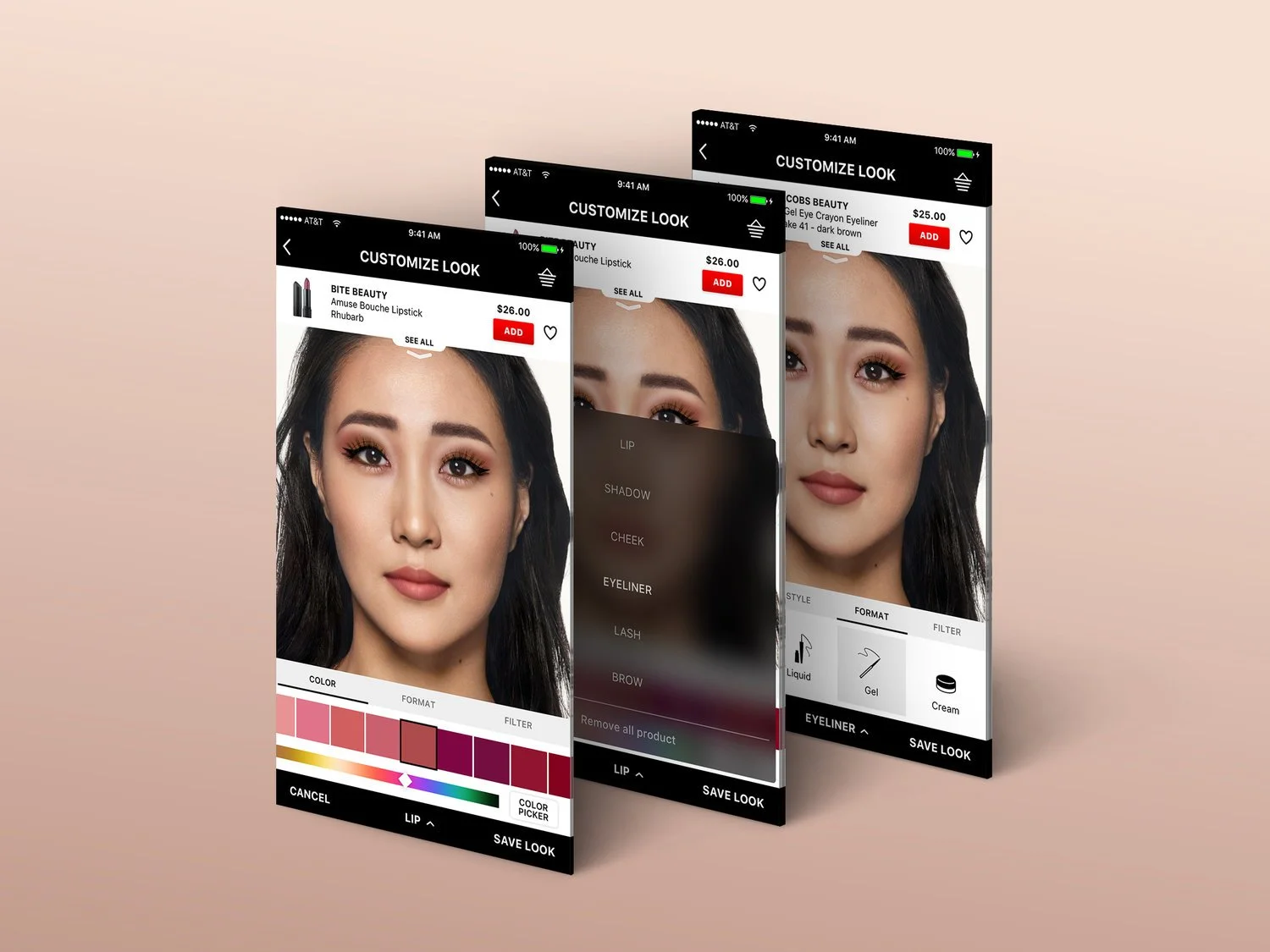
Whether you are looking for a new shadow or lip shade, color selection is a critical component to the success of the Product Try-On experience. Hence explored several ways customers could shuffle through different shades across different product types.
We evaluated the pros and cons of the color selection tool and decided to get additional feedback from users to see which experience was more intuitive. We created a prototype and partnered with the client to conduct Field Testing. We learned that while customers enjoyed interacting with the wheel, the color spectrum allowed customers to easily see all the colors available in a single glance and jump to that shade with a single tap.
Bringing the Experience to Life
Upon the client’s approval of the updates interaction flows, without wasting time, we started tearing through designs in order to meet the aggressive two month timeline for this statement of work. Luckily, we were able to leverage the existing Sketch shared library we had built from SVA 5.0 — which proved essential for the scalability and timeline. I contributed to design system by creating new UI elements and iterated on component variations that were developed and added to the library as the app evolved in 6.0.
Design System // Style Guide on iOS and Andriod
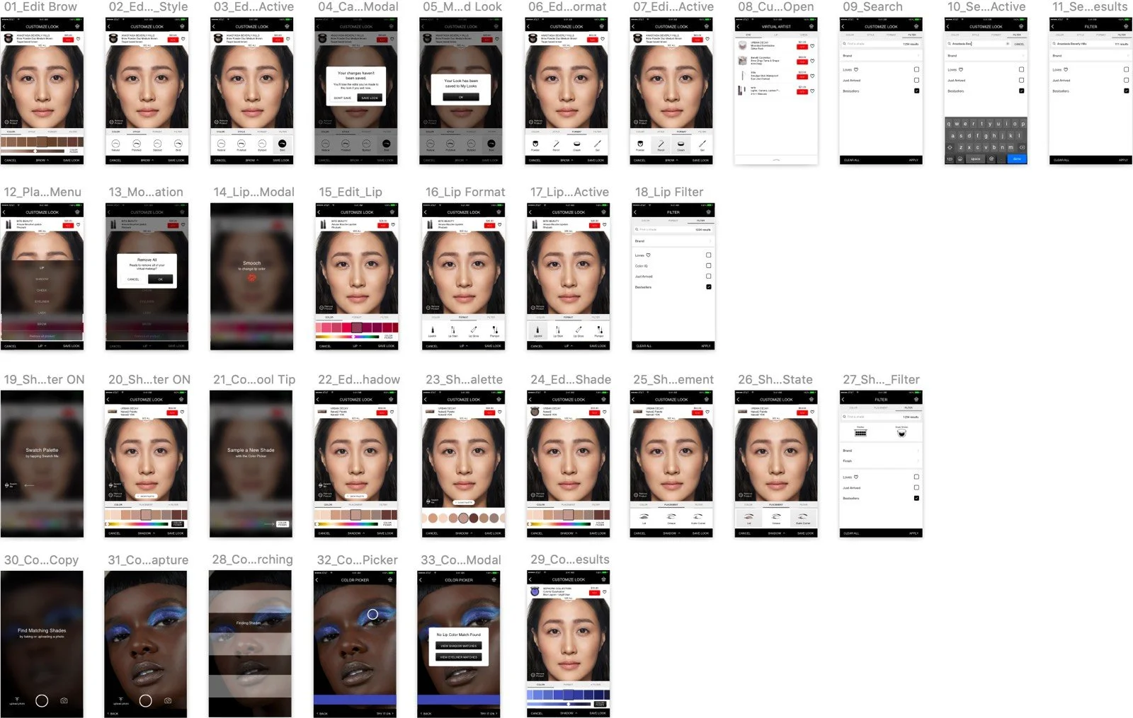
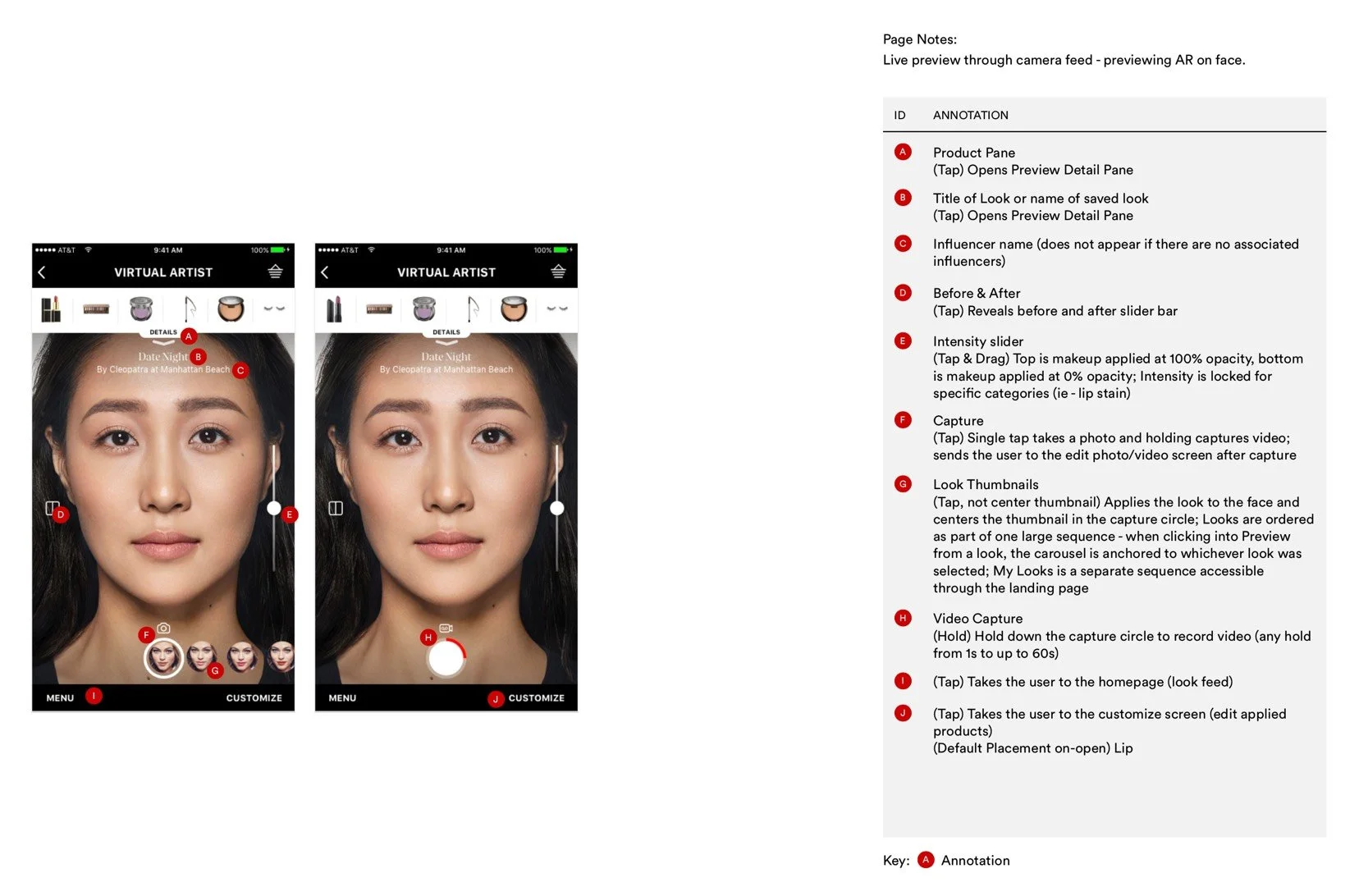
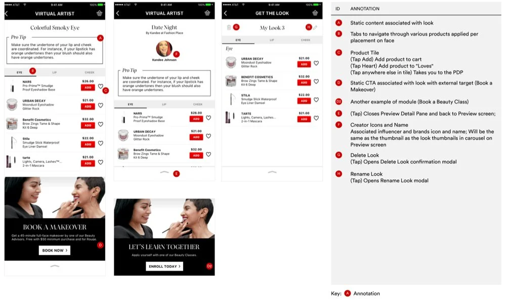
Three hundred and fifty screens later, we passed files off to Sephora’s development team with bullet-proof annotations. We supported with QA testing on iOS and Android, ensuring the live product stayed true to our designs and Sephora’s sophisticated brand.
Hi-fidelity Designs
UX
Design Strategy
Competitive Audit
User Journey
Wireframes
DESIGN
Design Comps
Functional Specs


